

Purposeful Typography: Nancy (Xinxuan) Gao
By Cansu Peker
Nancy (Xinxuan) Gao is a multidisciplinary designer with a focus on visual identity and typography. A graduate of ArtCenter College of Design, she discovered her love for branding and font design early on and has been exploring both traditional and digital approaches to design ever since. Whether working with paper or writing code, Nancy enjoys exploring how design can communicate and connect.
For Nancy, typography is function and form working together. She believes every typeface has a purpose, shaped by the people it's meant to reach. Once that’s understood, the real creativity begins. Her work has been recognized by Graphis, Communication Arts, the Muse Awards, and the World Brand Design Society, and she’s especially passionate about using customized typography as the heart of a brand’s identity.
We asked Nancy about her art, creative process, and inspirations.

Can you tell us about your background as a digital artist? How did you get started in this field?
Since childhood, I have been passionate about painting and traditional sketching, which sparked my deep interest in color and shapes. This fascination naturally led me to pursue graphic design. I earned my BFA in Graphic Design from ArtCenter College of Design, where I explored typography and gained hands-on experience in building visual identities. Over time, I discovered my true passion for branding and developed a strong empathy for the stories and concepts that shape each brand. As I continue refining my skills, my career path has become increasingly clear—I am driven to be a graphic designer with a strong emphasis on branding.

Your work spans from traditional paper to coding — how does this range influence your design process?
When working with traditional print media, like editorial design, typography feels like static puzzle pieces. My focus is on balancing negative and positive space, refining layouts, compositions, colors, and type variations. However, when designing for screens and working with creative coding, the variables expand—almost everything is dynamic and changeable.
In this case, I have to think ahead before sketching on the canvas—anticipating audience expectations, considering how they will interact with the design, and finding ways to spark their curiosity while ensuring clarity and ease of use.
Although these two platforms are vastly different, their core principles remain the same. What I’ve learned from editorial design continues to shape how I approach new media. After all, every design challenge—whether on paper or a screen—begins as a blank canvas, waiting to be explored.

Can you share a project where typography played a central role in shaping the overall identity?
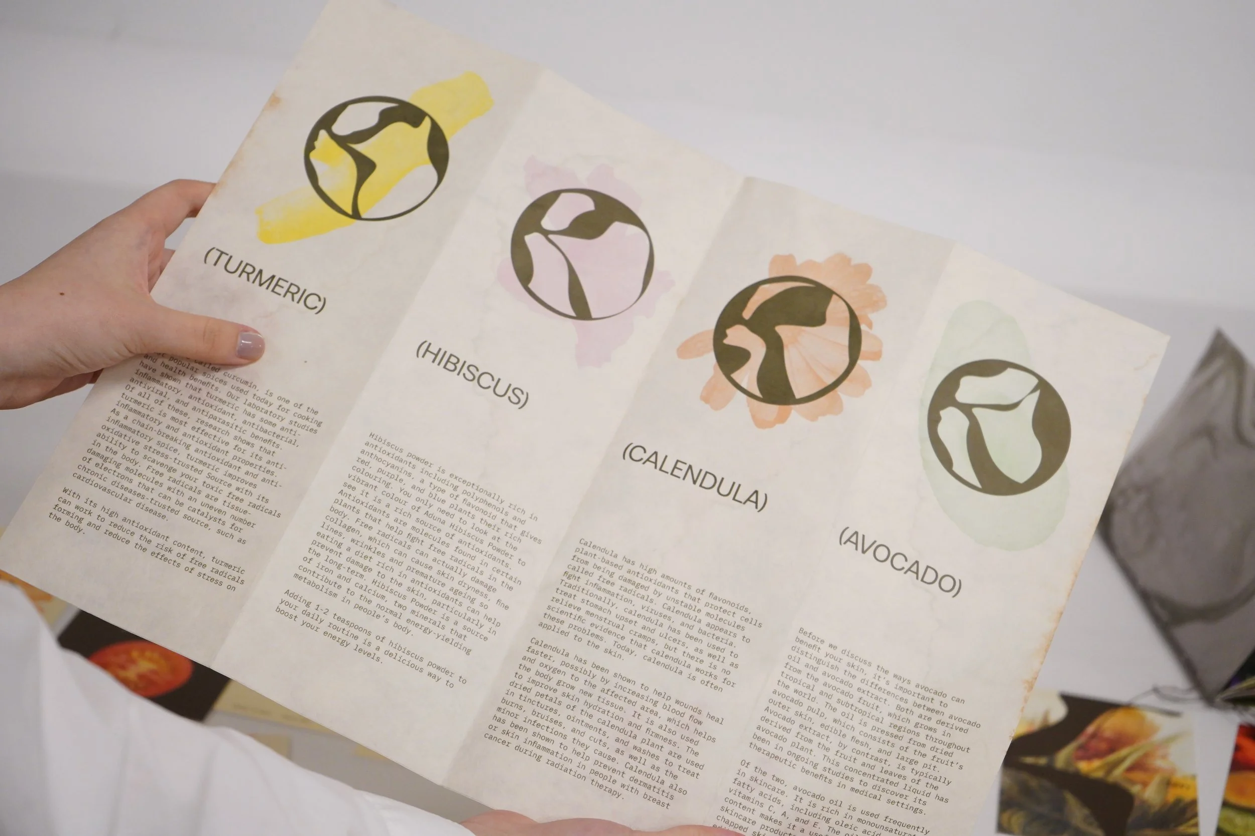
I love using customized typography as a central role in the overall identity, the one I shared here is the visual identity work for Ojai Music Festival. This festival aims to perform and share experimental classical music composed by contemporary musicians with all music lovers. Inspired by sound, each letterform was crafted to reflect the fluidity of musical notes and the dynamic nature of sound waves. Just as music ranges from the deep resonance of a cello to the rhythmic beat of percussion, the typography in this project embodies those qualities—creating a visual symphony that mirrors the festival’s experimental and harmonious spirit. Here, typography transcends its traditional role and becomes a symbolic representation of sound itself.


What inspires you when designing fonts, and how do you balance aesthetics with functionality?
Functionality is the top priority when designing fonts. Typography surrounds us in daily life—the signage in a metro station, the lettering on a coffee shop sign, or the playful type in a children's park. Each font serves a purpose, dictated by its specific audience. Once we define that audience, we understand how much creative freedom we have.
For example, a metro station font, designed for informational clarity, should be quiet, highly legible, and likely sans-serif rather than serif. From there, we refine the details—the curve of an “a," the beak of an “e”—balancing readability with aesthetics. Through multiple rounds of polishing, we ask ourselves, 'Is this too much?' 'How do these letters work together as a word?' These questions guide us in achieving the perfect balance between functionality and beauty.

What are some challenges you’ve faced in designing for both print and digital mediums?
In print media, one of the biggest challenges is the difference between how visuals and typography appear on screen versus in physical print. When designing digitally using Adobe or other tools, the scale and colors can look entirely different once printed. That’s why I always do a test print before refining the details further.
For digital work, such as web design, the challenge shifts to understanding audience interaction. Unlike print, where the layout is fixed, web design requires considering how users will navigate and read the content. Ensuring a comfortable reading experience is key. Sometimes, I get carried away with creative ideas and have to remind myself that clarity, simplicity, and ease of navigation are just as important as visual impact.
What is a dream project you’d like to make one day?
I don’t have a specific dream project at the moment, but I’d love the opportunity to work on a typography project that explores the limits and possibilities of AI in type design.

How do you see visual design evolve in the future?
Visual design is constantly evolving—from paper to computers to AI—as technology advances, so do the possibilities. In the future, I imagine design becoming even more accessible, allowing people to create and customize their own visuals, like personalized emojis. This field is becoming more open, inviting more people to engage with and shape the world of design.

What is a profound childhood memory?
That’s a great question. I wouldn’t say I have one particularly profound childhood memory, but my childhood as a whole was very memorable. My parents were incredibly supportive, and we traveled often. Although the education environment was somewhat toxic—especially during high school—my early years were filled with freedom, creativity, and time with family. Looking back, I truly appreciate those moments… honestly, I wouldn’t mind going back to my childhood!

Are you our next spotlight artist? Submit the form to apply to be featured!
We share works by digital artists as well as digital arts exhibitions, events, and open calls daily on Instagram — follow us for more and subscribe to our newsletter so you don’t miss new blog posts.


