Artist Interview: JJ
Jie Jian (JJ) is a Brooklyn-based artist, graphic designer, and type designer whose work explores racial and gender issues, particularly focusing on Asian female representations in the U.S. She also reflects on the present through the lens of nostalgic childhood experiences. Her projects are often bilingual, designed to bridge communication between Western and Eastern audiences.
Type design is at the heart of JJ’s creative practice, transforming language into something visual and deeply expressive. For her, letters aren’t just tools for communication — they are textures, rhythms, and structures with their own stories. By studying type design, she’s learned to weave these elements together, exploring the relationship between form and meaning.
Through her work, JJ has come to appreciate the cultural and historical contexts behind typefaces, seeing them as a rich source of inspiration. Every font tells a story, and by understanding these stories, she’s able to approach her designs with curiosity and intention. Whether creating for books, exhibitions, or digital platforms, JJ uses typography to connect meaning with emotion, inviting audiences to experience language in a new, visceral way.
We asked JJ about her art, creative process, and inspirations.
Sinful Magical Girls
Can you tell us about your background as a graphic designer? How did you get started in this field?
My journey as a graphic designer is shaped by cultural diversity and personal exploration. Growing up speaking multiple languages, I developed an instinctive way of understanding letters and imagery. My native language, Chinese, with its hieroglyphic roots, taught me to see letters as shapes and forms before grasping their meanings. This way of seeing became the foundation of how I approach design, allowing me to blend visual aesthetics with conceptual depth.
Over the years, I’ve had the opportunity to collaborate with international galleries like Hauser & Wirth and David Zwirner, experiences that expanded my understanding of design on a global scale. Recognition from platforms such as the Tokyo Type Directors Club and the Indigo Design Awards has affirmed my belief in the universal power of visual storytelling. For me, design is about connection — transcending language and cultural barriers to create something that resonates universally. These experiences continue to influence my work, inspiring me to craft designs that speak to both the eye and the heart.
Among Friends
Can you elaborate more on your passion for type design and how it influences your overall approach to art and graphic design?
Type design lies at the heart of my creative practice because it transforms language into something tangible, visual, and deeply expressive. Letters, for me, are more than tools for communication—they are textures, rhythms, and structures that carry their own stories. Studying type design has given me the ability to weave these elements into my work, enabling me to explore the intricate relationship between form and meaning.
One project that embodies this is Sinful Magical Girls. This book merges typography with narrative, using carefully chosen typefaces to reflect the layered, emotional landscapes of girlhood. The fonts, paired intentionally, become more than letters on a page; they evoke moods, memories, and moments of self-discovery. This approach has drawn recognition from design communities, affirming my belief in typography as a medium for storytelling.
Through type design, I’ve come to see the cultural and historical contexts behind typefaces as a rich reservoir of inspiration. Each font carries a lineage — a story of its own — and understanding these stories allows me to approach my work with curiosity and intention. Whether designing for a book, an exhibition, or a digital platform, typography becomes a bridge that connects meaning with emotion, inviting viewers to experience language in a new, visceral way.
Sinful Magical Girls
Many of your projects are bilingual, bridging Western and Eastern audiences. What are the unique challenges and rewards of designing for cross-cultural communication?
Designing bilingual projects is a journey of navigating both the visible and the invisible — the text, of course, but also the emotional and cultural nuances that lie beneath it. One of the greatest challenges is preserving the emotional depth of a message during translation. Words often carry layers of meaning that can shift or even disappear between languages. This is where visual design becomes essential, offering a way to bridge the gaps that language alone cannot fill.
In Sinful Magical Girls, for instance, I drew upon both Eastern and Western influences to craft a narrative that transcends linguistic barriers. The project evokes universal themes of girlhood, pairing typography and imagery in ways that resonate across cultures. Balancing two scripts in bilingual design also presents its own challenges. Fonts must not only complement each other visually but also honor the cultural and historical context of each language. The rhythm of Latin characters often contrasts with the vertical elegance of Chinese or the flowing curves of Japanese, making the choice of typefaces a deliberate act of bridging worlds.
The greatest reward, however, is when the design speaks to people regardless of the language they speak. When someone from the East and someone from the West can stand in front of the same piece and feel a shared connection, it reminds me of why I do this work. It’s about more than design—it’s about creating a space where cultures meet, where differences fade, and where stories become universal.
Muted Realities
You've curated exhibitions like Muted Realities with ETA Gallery. What do you enjoy most about curation, and how does it complement your design work?
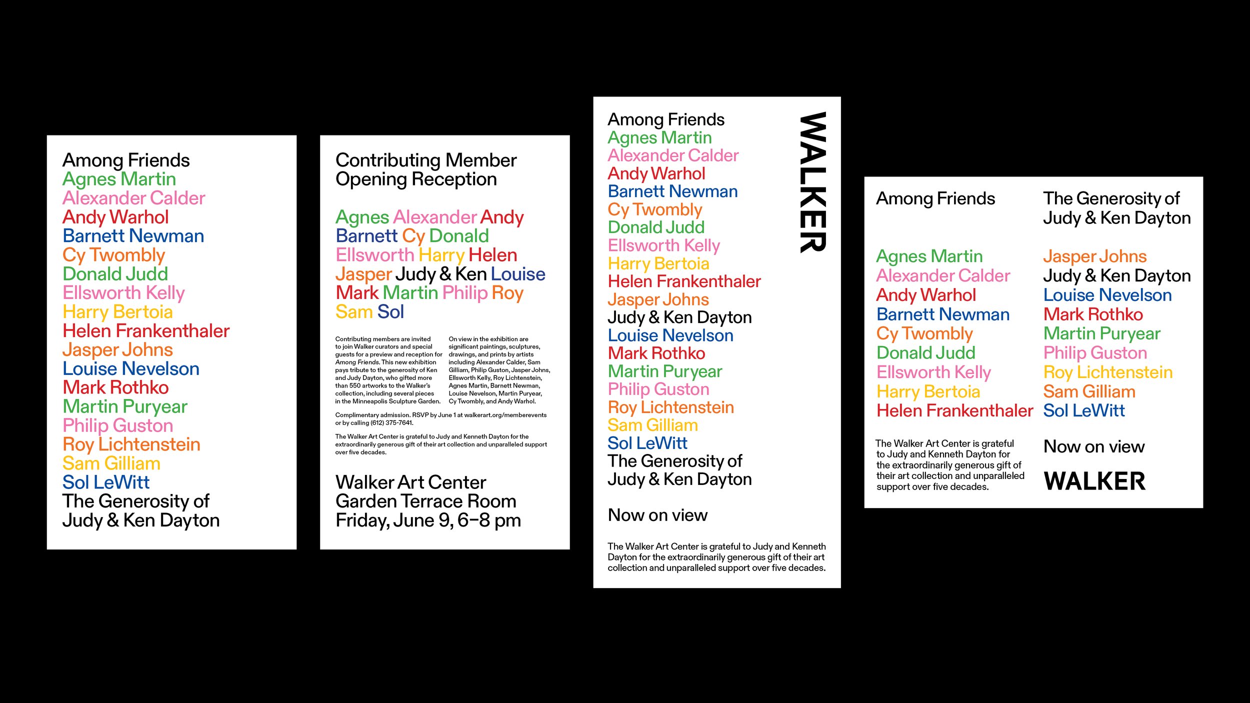
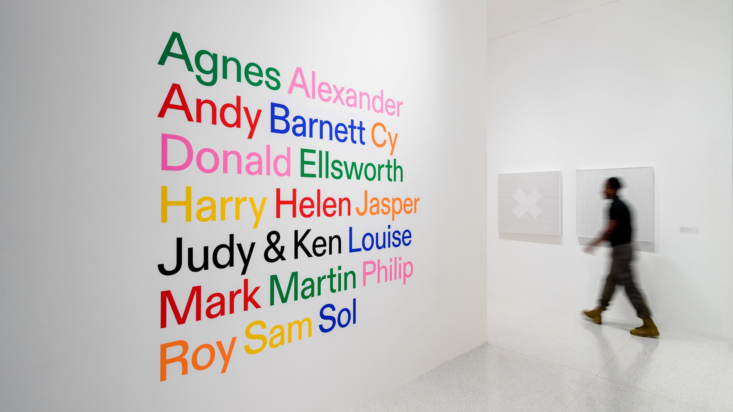
Curation excites me because it’s an opportunity to craft narratives that unfold in space, engaging audiences through both visual and emotional experiences. My passion for curation began during my time at the Walker Art Center, where I designed the exhibition graphics for Among Friends. This year-long exhibition celebrated the relationships between Judy and Ken Dayton and the artists they supported. To reflect the personal nature of these connections, I chose to present all names, including Judy and Ken’s, using first names only. This seemingly simple design decision transformed the exhibition into an intimate dialogue, visually emphasizing the closeness between collector and artist. It was a turning point for me, demonstrating how design can communicate human relationships beyond words.
At ETA Gallery, which I co-founded, I’ve built on this foundation, curating exhibitions like Muted Realities that highlight emerging voices and respond to the evolving cultural landscape. Curation allows me to explore themes and ideas on a broader scale, bringing together different works to create a cohesive experience. It complements my design work by reinforcing my belief in storytelling as a central thread, whether through spatial arrangements or graphic elements.
What I enjoy most about curation is the collaborative energy — it’s about listening to the voices of artists, understanding their stories, and weaving them together into a unified narrative. It’s a process that requires both sensitivity and intention, much like design. For me, curation and design are deeply interconnected. Both are tools for connection, each offering a unique lens through which we can explore and share the human experience.
Muted Realities
How do you hope your work influences the way people think about racial and gender issues, particularly regarding Asian female representation?
My work is driven by a desire to foster reflection and create connections across diverse audiences. As an Asian woman, I approach design as both a platform and a lens—amplifying voices like mine while engaging with broader, universal themes. Projects like Sinful Magical Girls exemplify this approach. Through a combination of typography, narrative, and design, it provided a space to explore girlhood experiences, weaving personal stories into a shared visual and emotional language.
This project not only gave form to often-overlooked perspectives but also invited audiences to reflect on their own identities and experiences. My hope is that my work acts both as a mirror and a megaphone—helping people see themselves while shining a light on narratives that deserve greater visibility. In addressing issues of race and gender, particularly Asian female representation, I strive to move beyond stereotypes, offering nuanced, authentic portrayals that resonate universally and inspire meaningful dialogue.
Sinful Magical Girls
If you could design a typeface inspired by a moment in your childhood, what would it look like and why?
Growing up by the ocean, I was mesmerized by the rhythm and movement of waves. Though buildings eventually obscured my view, the memory of the sea remains vivid. I'd design a typeface inspired by these waves, with flowing, undulating forms that mimic the ebb and flow of water. The design would capture the serenity and dynamism of the ocean, offering a sense of calm while maintaining an organic unpredictability — just like the sea itself.
Among Friends
How do you see digital design evolve in the future?
I believe digital design is heading toward a future where interactivity takes center stage, fostering deeper audience engagement and participation. One of my projects, Portals, reflects this vision. It’s an interactive, hand-coded website where visual elements move in circular, portal-like forms, inviting users to explore through dynamic, shuffling buttons. This approach encourages curiosity and discovery, turning passive viewers into active participants.
As digital tools continue to evolve, I see the boundary between creator and audience becoming increasingly blurred. Designs will shift from being static experiences to participatory ecosystems, where users have the agency to shape their interactions. Emerging technologies such as augmented reality, AI-driven customization, and immersive web experiences will play a crucial role in this transformation. For me, digital design is not just about functionality— it’s about creating spaces where people can connect, explore, and co-create in ways that feel personal and meaningful.
Muted Realities
What's the most unusual or unexpected place where you've found inspiration for your designs?
Long drives and road trips are my favorite source of inspiration. There's something meditative about zoning out while the scenery changes—it's often when my best ideas come to me. These moments of mental stillness allow thoughts to surface naturally, leading to unexpected creative breakthroughs.
Among Friends
What else fills your time when you're not creating art?
I love exploring coffee shops and crocheting while I'm there. It's a way to unwind and recharge while staying creative in a different medium. The tactile nature of crocheting contrasts nicely with my digital and visual work, offering a fresh perspective.
Among Friends


